
Hungry Goose is a playful, community-first cafe I built from the ground up — designing the brand, menu, space, and digital presence to serve comfort food and good vibes on a new university campus.
TIMELINE
TEAM
TOOLKIT
SKILLS
How do we create something that brings joy, energy, and good food to a place that desperately needed it?
Lets talk about the backstory...
When Wilfrid Laurier University announced its brand-new campus in Milton, Ontario, it sounded exciting — until you realized it was opening in the middle of nowhere. Think...industrial parks, empty lots, and not a bagel or coffee shop in sight.
No food plaza, no campus buzz, no cozy spots to hang out between classes.
That’s when a simple question sparked an idea...
So...what did I do?
I rolled up our sleeves, got to work, and brought Hungry Goose to life — a cozy, independent cafe that served comfort food, created community, and added a whole lot of flavor to an otherwise empty campus.


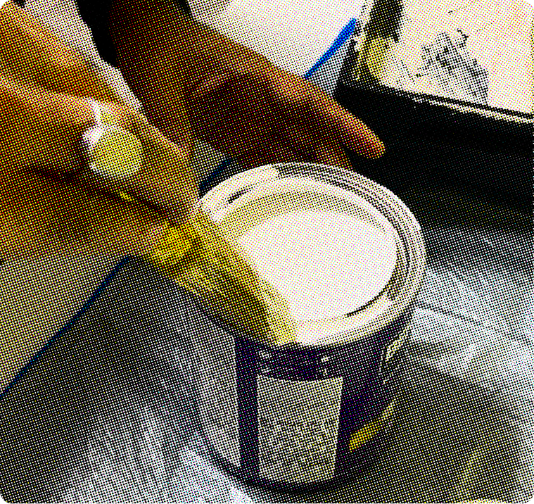


No contractors, no shortcuts — just me, a roller, and 50 paint swatches later. The Hungry Goose blue was born!
Ops + Setup
Once the construction process was complete I set up all the behind the scenes ...

Sourcing & Inventory
→ Researched local suppliers for baked goods, coffee, and other ingredients
→ Negotiated with vendors to secure quality ingredients within a tight budget
→ Created inventory tracking sheets + restocking systems to avoid shortages

Hiring & Onboarding
→ Built a small team from scratch (baristas + counter staff)
→ Trained new hires on POS systems, food safety, and brand tone
→ Designed simple workflows that made the space run smoothly

Supply Chain & Equipment
→ Compared various commercial equipment pricing to find the right fit
→ Set up cleaning protocols, order management, and closing checklists
→ Handled all initial equipment sourcing and purchasing

Documentation & Processes
→ Built Airtable tracking for scheduling, supply ordering, and training docs
→ Created a custom operations manual with opening/closing routines
Now Lets
Talk Digital...
While the cafe lives in the real world, Hungry Goose’s identity was shaped just as much through its digital presence — from logo and typography to the website, menu, and marketing. I treated every touchpoint like part of a bigger brand story.

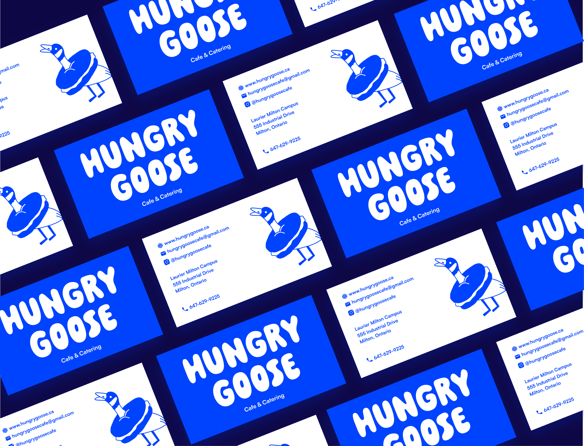
Brand Identity
I started by exploring a wide range of logo sketches, illustrations, and typography combinations to find a look that felt playful, bold, and clean


Website Design - Iteration 1


The Big Takeaways of V1
I kept the layout simple and scrollable — no frills, just the essentials: menu, location, and story.
Designed with mobile-first in mind since most users would be checking it on-the-go.
I used playful, approachable language and large imagery to give the site personality that matched the in-cafe experience.
Iteration 1 - Limitations
1. No Clear Hook Above the Fold
The homepage lacked a strong opening message or hero image of our most popular dishes
2. No Dedicated Product Pages
Every dish was squeezed into one grid, which limited storytelling, SEO, and search discoverability
3. Weak Lead Collection
The catering form was the only entry point for user info - no incentive, no clear CTA, and no general mailing list
4. Missing Social Proof
No testimonials. We had tons of positive word-of-mouth and IG DMs — but it wasn’t reflected on the site
Website Design - Iteration 2


Why I love the Second Iteration
The second iteration wasn’t just a visual upgrade — it was a full transformation. I rebuilt the Hungry Goose site to reflect what the cafe had become: a vibrant, loved community space with personality, loyal fans, and damn good food.
Photography that makes you hungry 🤤
Instead of relying on stock images or flat graphics, I art directed and shot custom food photography that showed our best-selling items the way customers actually see (and crave) them — gooey grilled cheese pulls, crispy samosas, loaded pizzas. These visuals became core to the new homepage and product tiles.


A Better Browsing Experience ✨
The new layout introduced smoother flow, stronger hierarchy, and interactive components:
Tabbed menu to toggle between Popular / Drinks / Food
Visual CTA buttons with better contrast and stronger copy
Highlighted our top dishes as clickable cards for future expansion
Clear Hours, Location, and Contact Info that didn’t require scrolling forever
Print and
Presence...
To support the launch, I designed a full suite of branded print materials for Hungry Goose — including eye-catching posters, business cards, catering flyers, lawn signage and more. These assets were strategically placed around campus, inside classrooms, on community bulletin boards, and near high-traffic student areas. The playful visuals, paired with clear CTAs and QR codes, made it easy for students to learn more, view our menu, and spread the word. These physical touch points played a key role in driving our initial customer growth and early revenue, acting as constant reminders that good food was just around the corner.


Growth + Impact Highlights...
👥 Built a loyal customer base from scratch, with regulars returning multiple times per week
💵 Reached a consistent monthly revenue of $7K+, validating the business model and proving strong demand for high-quality, affordable food on campus
🧾 Increased catering inquiries and group orders, especially from faculty and student events — opening new revenue streams beyond daily sales
✨ Laid the foundation for future expansion, including menu growth, job opportunities, and a brand that students now associate with quality and community
🚀 Proved out a full-stack launch — from design to operations — with zero external marketing spend
Interested in working together? Lets talk :)

